natessweetblog
Just another WordPress.com site
Streams, Mountains, Mist, and Trees

Wu Zhen; Streams, Mountains, Mist and Trees; Yuan Dynasty; Location Unknown
Wu Zhen (1280-1354) was a Chinese painter who lived and worked during the Yuan dynasty, and is most well known for his smooth, flowing landscape paintings. Zhen was one of the “Four Masters of the Yuan,” a group of Yuan-Dynasty Chinese painters who were known for being deeply influenced by the styles of the old masters of Chinese landscape painters who were active during the 9th and 10th centuries. Zhen’s signature slopping, smooth and curvy lines were in fact a direct throwback to the style of those older works. The fantastical, less-than-naturalistic nature of his paintings too, hearkens back to the old, traditional style of Chinese landscape paintings.
This particular painting depicts lush wilderness, drifting mists, and majestic, curving mountain peaks. And, like most Chinese landscape paintings, it also includes a lone person, who, I believe, the viewer is meant to “take the place of,” and imagine themselves in the midst of the scenery. I think this work is painted on parchment, and only black ink is used. The level of detail is impressive, and even though the sense of perspective seems a little skewed (as most paintings of this era seem), the grandeur of the scene is undiminished.
I’ve really liked all the Chinese landscape paintings I’ve looked at so far, but I liked this one especially. To me, this one seems slightly less visually “busy” than some, and I think that benefits the painting by letting the attention focus on the beautifully crafted mountain peaks. At the same time though, it isn’t as sparse as some I’ve seen; the intricate brushwork detail of the shrubbery, grass and trees is mesmerizing. It doesn’t overwhelm, though, and it doesn’t call too much attention to the fact that super-realistic perspective was an artistic technique yet to be perfected. The mist hides this especially well, and provides this painting with a wonderful mystical vibe.
(a full view)

.
.
.
<Sources>
http://www.chinaonlinemuseum.com/painting-landscape.php
http://www.chinaonlinemuseum.com/painting-wu-zhen.php
Man of Fire

……
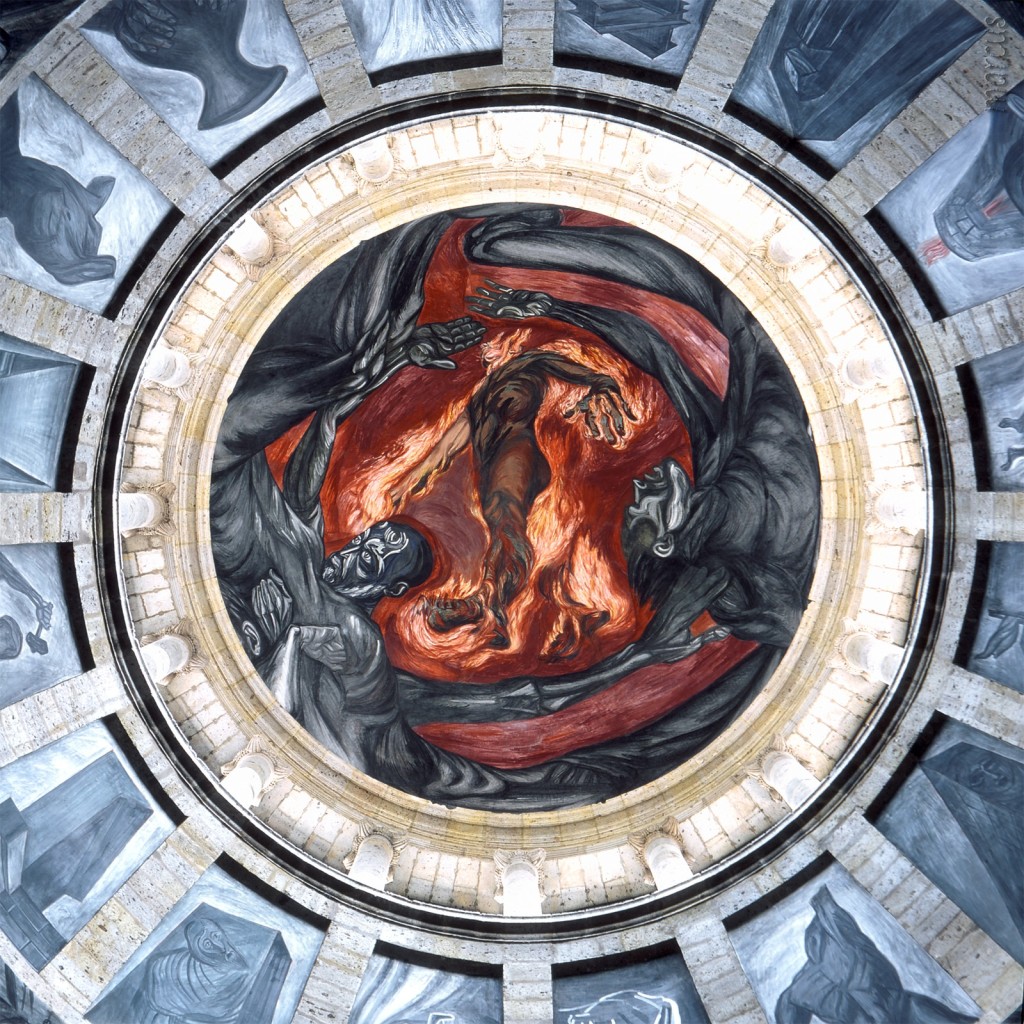
-Jose Clemente Orozco; Man of Fire; 1938-9; Hospicio Cabanas, Guadalajara-
Jose Clemente Orozco (1883-1949) was a socially-conscience Mexican muralist whose works expressed sympathy towards the causes of the lower working classes. He was born on November 23, 1883 in Jalisco, Mexico, and at an early age he lost his left hand while playing with gunpowder. This didn’t stop him from wanting to becoming an artist though, and he later attended the San Carlos Academy for Fine Arts in Mexico City. The bloody Mexican Revolution deeply influenced Orozco’s view of the world, as is deeply evident in the content of his works — on one hand, he remained throughout his life an ardent supporter of the causes of workers and peasants, but he also harbored a deep pessimism about the moral state of humanity.
This particular mural is regarded as both Orozco’s masterpiece and one of the finest murals ever created in the twentieth century, and its not hard to see why. Painted in the Hospicio Cabanas in Guadalajara, this mural depicts a man, wreathed in flames, ascending into the roof of the structure. Surrounding him are a mass of dark grey figures representing the natural elements (Earth, Air, Water and Fire), and lower still are 16 vaguely unsettling images arrayed around the cupola.
I think this is an astounding mural. It’s bold, powerful and dramatic. The artist’s minimalist use of colors (just shades of blue, grey and red) appeals to me as well. Clearly, this artist was at the top of his game. It’s no surprise that Man of Fire and it’s surrounding fresco is considered by some to be the “Sistine Chapel of the Americas”
However, I also found Man on Fire quite difficult to grasp. While I do find it impressive, dramatic and powerful, I don’t quite understand the meaning behind it. I understand that it’s a metaphor for social struggle, but the meaning behind the symbolism is beyond me. I searched for an analysis, but I couldn’t find any solid, specific explanation behind the imagery.
Still, I’m impressed by this work and am able to appreciate it. All of Orozco’s work is powerful, but I feel this one has a special kind of authority and significance.
.
.
.
.
<Sources>
http://www.wfu.edu/history/StudentWork/fysprojects/kmason/Omnfueg.htm
http://www.wfu.edu/history/StudentWork/fysprojects/kmason/Orozco.htm
http://en.wikipedia.org/wiki/Jos%C3%A9_Clemente_Orozco
http://gomexico.about.com/od/guadalajara/ss/hospicio_cabanas_3.htm
https://www.msu.edu/user/hockettj/Orzcpap.htm
http://www.pbs.org/wnet/americanmasters/episodes/jose-clemente-orozco/orozco-man-of-fire/82/
The Environment
Over the past few decades, visual art has become an increasingly important medium in the promotion of environmental concerns, be they pollution, sustainability, over-consumption or extinction. The topics of environmental consciousness and sustainability are very important to me, so I chose to exhibit works that express these environmental concerns, particularly those that do so in unique and eye-opening ways.
.
.

Mud-Graffiti by Jessi Graves
Jessi Graves is a Wisconsin-based artist who has devoted himself to spreading environmental awareness and messages of social justice through his art. The work he is most recognized for is his mud-graffiti; using only mud (a biodegradable medium) this artist spreads a message of environmental consciousness in urban areas for all to see. His temporary, biodegradable and highly visible form of street art has spread like wildfire beyond his home state, and environmentally-inspired messages in mud can be spotted in hundreds of cities across the country. On his website, he even provides instructions on how to do it yourself.
.
.

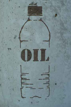
Jessi Graves “Oil” Graffiti; Date Unknown

Jessi Graves “Oil” Graffiti; Date Unknown
These two mud stencils depict a water bottle emblazoned with the word “Oil.” This graffiti immediately and bluntly reminds the viewer that water isn’t the only aspect of bottled water; petroleum is used to create the plastic for the bottles and is used to transport them. Even recycling them requires fossil fuels.
.
.

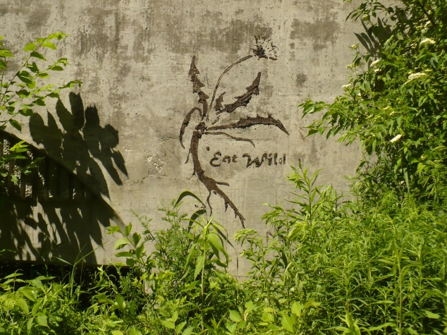
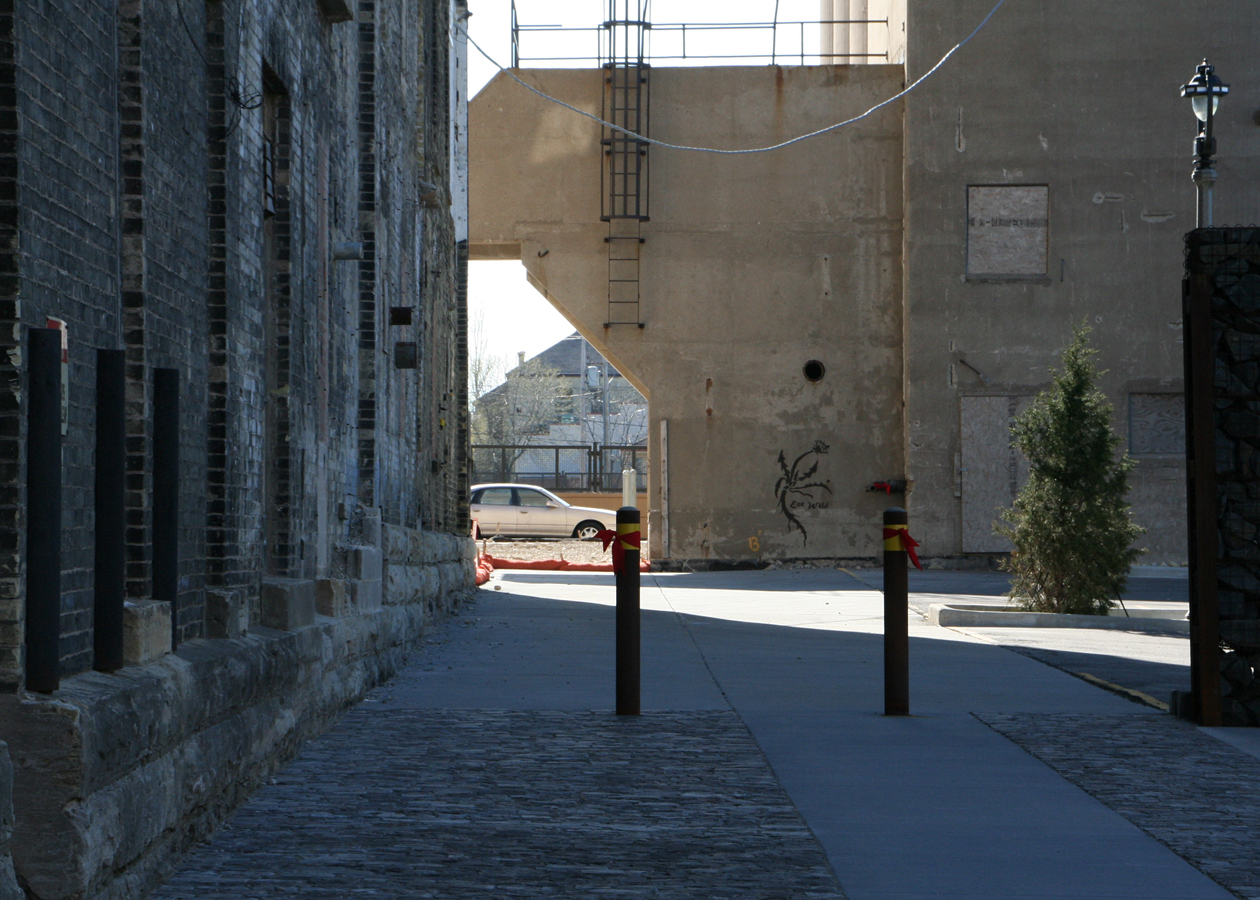
Jessi Graves “Eat Wild” Graffiti; Date Unknown

Jessi Graves “Eat Wild” Graffiti; Date Unknown
These mud stencils exhibit the artist’s belief in wild, organically grown foods. In particular, the dandelion, which is edible. In his statement concerning this stencil, Jessi Graves proclaims that wild food is nutritious and provides a connection with nature, and that wild food can be found anywhere, even in the urban areas where his mud art is located.
I really like all of Jessi Graves’ environmentally-friendly mud art and the ideas behind them. And the concept of exhibiting them in urban, public areas for all to see is especially brilliant. The art’s message reaches a much broader audience than it would than if it were in an art gallery.
.
.

Chris Jordan; Cell Phones #2; Atlanta, 2005
Featured in: “Intolerable Beauty: Portraits of American Mass Consumption” (2003-2005)
Chris Jordan is one of the most prolific and visible artists of the “green movement.” Like Jessi Graves, social justice and environmental concerns are his main artistic topic. He is most well known for his photographs and format works depicting the massive scale of global consumerism and waste. The above photograph depicts a massive sea of old cell phones, a sobering look at the scale of American consumerism. But only a tiny fraction of the amount of phones retired annually are depicted here; Jordan’s Cell Phones image below provides a much more accurate look at the scale of waste that exists in the US alone.
.
.
Chris Jordan; Cell Phones; 2007
Featured in: “Running the Numbers: An American Self-Portrait” (2006 – Current)
Unfortunately, the image of Cell Phones is simply too huge to be exhibited here; to get a real feel for it, you have to go to the artists web site and zoom in on the image.
This image (I’m almost certain its not a “real” photograph) depicts the number of cell phones (426,000) “retired” every single day in the United States alone. It’s an unfathomable amount of waste, but Jordan’s image manages to give you some kind of grasp on just what 426,000 cell phones might look like. It’s almost frightening to consider that this is the amount of waste produced every single day. It’s guaranteed that anyone who looks at this image is bound to think twice before tossing their old cell phone.
.
.
Chris Jordan; Plastic Bottles; 2007
Featured in: “Running the Numbers: An American Self-Portrait” (2006 – Current)
Like the previous image, Chris Jordan’s Plastic Bottles is too huge to exhibit here, so click on the link and zoom in on the image on his site.
This image is even more shocking than Cell Phones. Plastic Bottles depicts the amount of plastic bottles (2 million) used in the US not every day, but every five minutes. It’s almost too shocking to believe that the sea of bottles depicted in the image could possibly be an accurate depiction of how much we consume in a mere five minutes, but it is.
It’s terrifying to consider the environmental damage the kind of waste depicted in these two images is doing to the Earth. Chris Jordan’s work makes these unfathomable numbers fathomable, and in doing so, lets us know just how much we as a nation consume and throw away.
“There’s no way like the American Way”

-Margaret Bourke-White; “At the Time of the Louisville Flood”; Louisville, Kentucky; 1937-
This is one of the most famous photographs depicting the effects of the Great Depression. Margaret Bourke-White’s “At the Time of the Louisville Flood”, taken in Louisville, Kentucky during 1937, shows a group of African American residents of Louisville waiting in line for food. Behind them, a huge billboard depicts the stereotypical happy American family enjoying a car ride, and is emblazoned with the phrases “Worlds Highest Standard of Living” and “There’s no way like the American Way”.
I feel that this is an ironic and even cynical photograph. Obviously, the contrast between the upper class, white “American Ideal” depicted on the billboard and the reality of the destitution among the black population of Kentucky is the central message behind this image; one of Margaret Bourke-White’s main concerns throughout her life, and the subject of many of her works was social injustice. This is a grim and pessimistic photo, and it really captures a vivid and honest image of the poverty brought on by the great depression. Margaret Bourke-White was clearly concerned about the hardships and inequalities produced by the Great Depression, and her photographs depicting its effects on the American people are among the very best ever taken.
.
.
<Sources>
http://www.artscenecal.com/ArticlesFile/Archive/Articles2005/Articles0405/MBourkeWhiteA.html
http://www.vpphotogallery.com/photog_white_timeoftheflood.htm
http://www.gallerym.com/work.cfm?ID=1357
http://www.gallerym.com/work.cfm?ID=1486
http://en.wikipedia.org/wiki/Great_Depression
Impressionism
I really, really love impressionism. I don’t really dislike any of the other styles of art we previously looked at, but I like impressionism especially. There’s just something about the blending of motion and color in many of the impressionist paintings that make it seem like your there; not necessarily “there” in a photo-realistic way, but “there” emotionally. It’s like impressionist paintings strive to capture the feeling of a moment, rather than the detail of an image.
I think John Singer Sargent’s Lights and Shadows, Corfu is a good example of this “capture the moment” focus impressionist paintings have.
 John Singer Sargent; Lights and Shadows, Corfu; 1909
The shadows on the side of the building seem to dance and jump around, and you can almost feel the warm breeze. Using light, color and shape, the artist beautifully captures the feeling of a moment.
Not all impressionist paintings attempt to depict pleasant moments, though. In one of my favorite impressionist works, Gassed, also by John Singer Sargent, a line of wounded soldiers are led away after being caught in a gas attack during World War One.
 John Singer Sargent; Gassed; 1918
This painting certainly captures the feeling of a moment; the soldiers featured in it are tattered and in agony, and you can barely see any ground in this painting- there are so many wounded men. This, and everything from the eerie yellow-toned lighting to the friendly game of soccer taking place in the background (look closely) is strange, ugly and terrifyingly real; it captures and transmits powerful feelings. Using descriptive color and lighting and unapologetic realistic imagery, it captures the horror of war every bit as convincingly as a photograph could.
These paintings inspire feelings and emotions in me in a way most earlier paintings don’t; take for example Oath of the Horatti by Jaques-Louis David.
 Jaques-Louis David; Oath of the Horatti; 1784
Though I certainly don’t dislike it, it doesn’t hit me on a gut level emotionally, as Gassed does. I think this is because I just can’t take the theatrical style of the neoclassical Oath of the Horatti seriously. It might just be me, but, though often beautiful, I find many older style paintings like this one to lack the kind of honest visual power, I guess, of so many impressionist paintings. I guess I can’t really put the feeling in words very well, but hopefully you can “get” what I’m thinking, here.
Impressionism is definitely my favorite style so far…
Sources:
http://jssgallery.org/Paintings/Gassed/Gassed.htm
http://jssgallery.org/Paintings/Lights_and_Shadows_Corfu.htm
Beethoven’s 9th Symphony
Ludwig Van Beethoven, Symphony No. 9, Completed 1824, ?Vienna?
Said to be his greatest work and one of the greatest pieces of music ever composed, Beethoven’s 9th Symphony was also the last symphony he completed. Commissioned by the Philharmonic Society of London in 1817, it was completed in February of 1824. It’s hard to overstate how well known this piece of music is; I think it’s fair to say everyone recognize the first few notes, even if they aren’t able to name the music. Beethoven’s 9th is so significant in western culture, in fact, that it was made the official anthem of the European Union.
Beethoven was the one of the first composers to remain a freelance artist, and he supported himself by composing, performing and publishing his great musical works. His ability to do this was in no small part thanks to the rising middle classes, who were producing a great demand for good, accessible music. Beethoven’s 9th Symphony, like all his symphonies, was melody-driven, instrumental, and could be understood and enjoyed by everyone. These qualities appealed to the middle classes, who surely enjoyed it then just as much as we can enjoy it today.
I love this music. Before this class, I don’t think I actually heard any of it beyond the first couple of notes. There are just so many layers and contrasts of sound; I don’t have the words to describe it. It’s unbelievable that he composed this while completely deaf! It doesn’t seem possible. This guy knew his music…
Sources:
<http://en.wikipedia.org/wiki/Classical_period_(music)>
<http://en.wikipedia.org/wiki/Ludwig_van_Beethoven>
<http://en.wikipedia.org/wiki/Symphony_No._9_(Beethoven)>
Rembrandt’s “The Mill”
Rembrandt; “The Mill”; 1645-8; Location Unknown
Rembrandt’s largest landscape painting, “The Mill”, painted sometime between 1645-1648, depicts a solitary windmill on a hill soon to be enveloped, it seems, by foreboding-looking dark clouds coming from the left. At the foot of the hill, several figures go about their lives; a woman looks like she’s washing something in the river, and the man in the small boat is rowing either towards or away from the shore. It is said to be based on a real-life windmill in Amsterdam the artist lived near, but this is impossible to verify. Windmills were a common sight in the Netherlands at the time; they were a symbol of the rising prosperity of the merchant class, and were considered a patriotic symbol (liu.edu).
What really draws my eye in this painting is the sky. The area behind and above the windmill is dark and brooding, and gives what would ordinarily be a tidy scene of socioeconomic harmony and prosperity a more sinister aspect. I don’t know what the economic or political climate was like in the Netherlands during this time, so whatever Rembrandt may have been trying to represent in this image eludes me. But I feel he must have been trying to represent something. The visual impact these dark clouds have on the viewer is just too intense to be ignored; Rembrandt, being Rembrandt, must have known this. Maybe he wasn’t commenting on any great, world changing event or worry at all. Maybe this is a more personal piece; a reflection of inevitability, foreboding or doom in his own life at the time.
Whatever the intended meaning of this piece, the feelings of dread and foreboding it incites are undeniably potent. This is a powerful work of art.
Works Cited:
Primavera, by Sandro Botticelli
“Primavera” by Sandro Botticelli; Uffizi, Florence; c.1482
“Primavera”, by Sandro Botticelli, is a tempera panel painting by Sandro Botticelli. It was most likely commissioned by a member of the Medici family, but the specifics of this piece’s history are shrouded in mystery(Wikipedia). It has been called by Botticelli, Primavera (1998), “one of the most written about, and most controversial paintings in the world.” This is an amazingly intricate mythological painting, usually agreed to represent the arrival of spring. There are no less than nine charecters exhibited here; Venus, Goddess of Love; Flora, Goddess of Flowers and Spring; the nymph Chloris; The three Graces; Mercury, Messenger of the Gods; Zephyrus, God of Wind; and Amor, the son of Venus.
I found this to be an incredibly striking piece of art. I love paintings like this with lots of intricate detail and storytelling. Every time I look at it, I see something new.
(sources)
Hello! I’m super excited for this course. It looks like its going to be very interesting


